
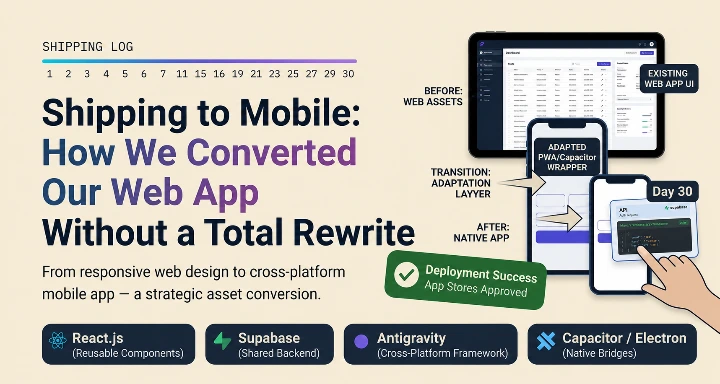
A few weeks ago, our team faced a big challenge. Our web application was running great, but our users kept asking for the same thing: "We need to use this on our phones."
Normally, building a mobile app means starting from scratch, hiring native mobile developers, and spending months writing new code. But we did not want to throw away the solid web code we had already worked so hard to build.
Instead, our engineering team figured out a smart way to transform our existing web app into a mobile-ready package. Here is exactly how we pulled it off.
1. Breaking the Frontend Free
Our first task was to separate our frontend from the backend environment. In a standard web setup, these two parts are often tightly linked together.
Isolating the UI layer: We went into the codebase and separated the frontend code from the backend setup.
Adding necessary configurations: We cleaned up the environment and set up the clean build configuration files needed for mobile.
Keeping the backend safe: Because we left the backend completely separate, we removed any risk of breaking our live database logic while we worked on the mobile transition.
2. Bridging the Gap with a Capacitor
With our frontend running on its own, we added the Capacitor.js module to the project.
Wrapping the web code: Capacitor acts as a bridge that wraps our existing web code inside a native mobile container.
Targeting both platforms: This allowed us to target both iOS and Android apps using the exact same web code we already had.
Accessing native features: It gives us the ability to connect to native phone features whenever we need them later.
3. Fixing Our Layouts with Claude Code
The toughest part of putting a web app onto a smartphone screen is the design. Layouts built for big desktop monitors look completely broken on a small phone screen.
Finding non-responsive areas: To fix our UI fast, we used Claude Code to scan our project.
Automating the tedious work: Instead of spending weeks manually rewriting hundreds of messy CSS files, Claude Code did the heavy work for us.
Making it touch-friendly: The tool automatically updated our styles and components to make everything touch-friendly and fully mobile-responsive.
The Testing and Results
After the UI cleanup, we spent a few days testing the new application on real mobile devices to check the scrolling, inputs, and loading speeds.
Ready for the stores: Our existing web code now runs perfectly as an app on both iOS and Android.
Native feel: The interface looks and feels like a native mobile app, thanks to the automated responsive updates.
Massive time savings: We saved months of development time and avoided the cost of building a separate native app from scratch.
What We Learned as a Team
This project proved that you do not need a massive budget or a separate native development team to ship to mobile. If you already have a stable web application, the foundation is already right in front of you. By organizing your build setups properly and using smart tools like Capacitor and Claude Code, you can deliver a high-quality mobile experience quickly and safely.